Chegg
Chegg
Optimizing Marketing Landing Pages
Optimizing Marketing Landing Pages
Optimizing Marketing Landing Pages
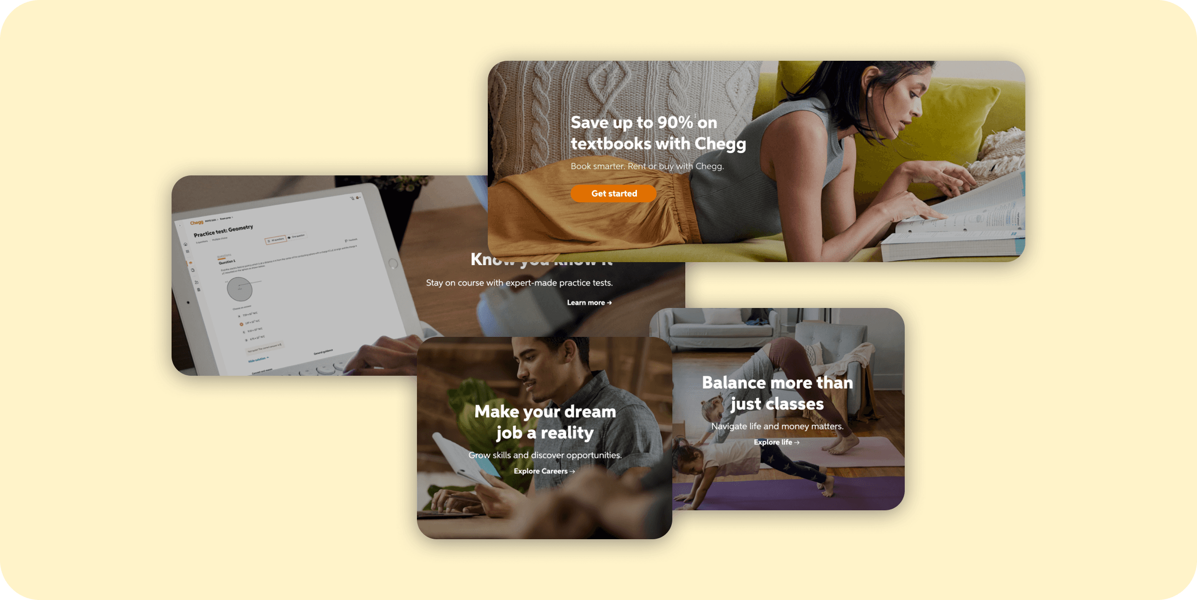
tl;dr After a rebrand, the marketing landing pages were initially experiencing an alarming dip in performance. Compared to the original landing page before the rebrand, the conversion rate dropped 30%. I conducted user interviews and A/B testing to quickly package actionable insights into clear recommendations that was communicated to all stakeholders. The key learnings that made the biggest impact on our iterations had three main themes: lack of awareness, attitude, and missed expectations. The CVR was improved by 33% of the original design, meaning even before the rebranded landing page. Our newly optimized landing page, produced results that our leadership was hoping new rebranded page would yield.
tl;dr After a rebrand, the marketing landing pages were initially experiencing an alarming dip in performance. Compared to the original landing page before the rebrand, the conversion rate dropped 30%. I conducted user interviews and A/B testing to quickly package actionable insights into clear recommendations that was communicated to all stakeholders. The key learnings that made the biggest impact on our iterations had three main themes: lack of awareness, attitude, and missed expectations. The CVR was improved by 33% of the original design, meaning even before the rebranded landing page. Our newly optimized landing page, produced results that our leadership was hoping new rebranded page would yield.
tl;dr After a rebrand, the marketing landing pages were initially experiencing an alarming dip in performance. Compared to the original landing page before the rebrand, the conversion rate dropped 30%. I conducted user interviews and A/B testing to quickly package actionable insights into clear recommendations that was communicated to all stakeholders. The key learnings that made the biggest impact on our iterations had three main themes: lack of awareness, attitude, and missed expectations. The CVR was improved by 33% of the original design, meaning even before the rebranded landing page. Our newly optimized landing page, produced results that our leadership was hoping new rebranded page would yield.
Role
UX Researcher
UX Researcher
UX Researcher
Methods
User Interviews, A/B Testing, Codebook Analysis
User Interviews, A/B Testing, Codebook Analysis
User Interviews, A/B Testing, Codebook Analysis
Background & Objectives
Chegg decided to have a major re-brand and product refresh, with the intent of addressing some of the tech debt and design debt that incurred over several years of rapid growth and acquisitions. While some aspects of the initial rebrand were a success, the marketing landing pages were initially experiencing an alarming dip in performance.
-30% conversion rate compared to the original page
Research questions
How do users interpret our landing pages?
What information do users need to answer their questions about our services?
What are common pain points and areas of opportunities for the landing page?
Business objectives
Improve the conversion rate (CVR) of website
Generate incremental revenue from our subscription services
My Contributions
I led all project planning phases including: Drafting the study plan; securing stakeholder buy-in; led cross-functional discussions; packaged actionable insights into clear deliverable that was communicated to all stakeholders in an iterative process.
Methods
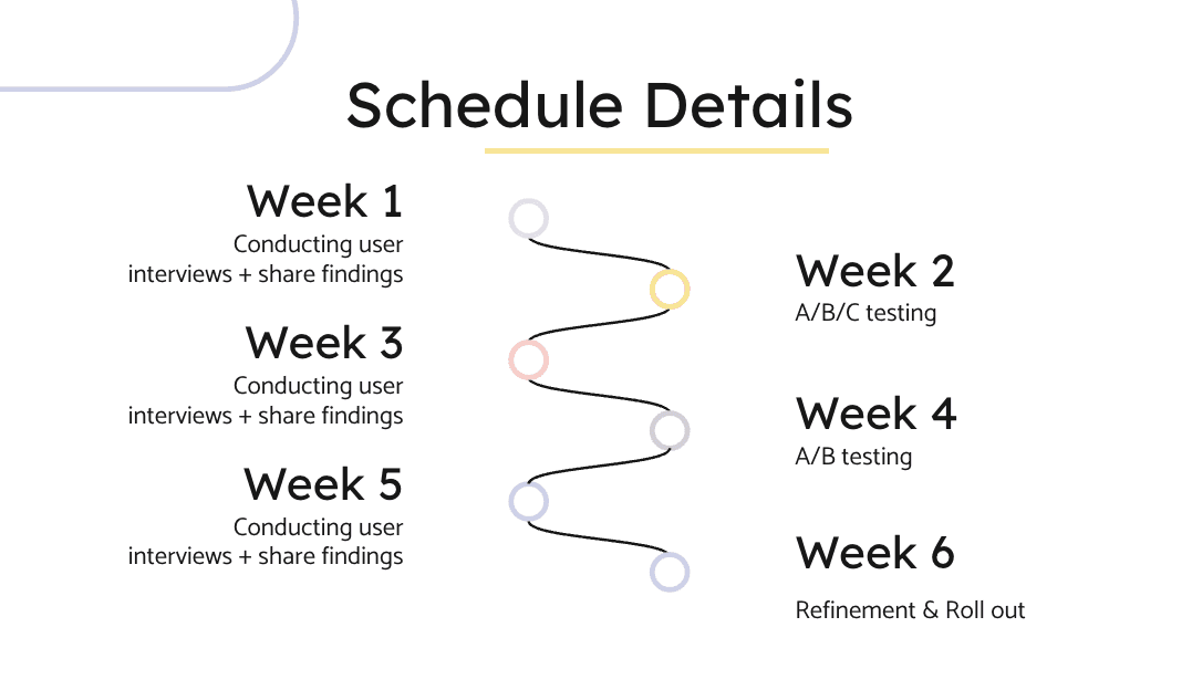
I conducted three rounds of user interviews with 5 participants per session over a 6-week period to gain exploratory insights into user behavior & quickly iterate and fix problems on our landing pages. These interviews allowed me to understand what users are understanding about the page, what information are they looking for, and what we’re missing.
Along with user interviews, I conducted A/B experiments to evaluate our hypotheses and design recommendations, as well as providing immediate results to our stakeholders. The A/B testing compared our design with the rebranded landing page iterations.
Participants
Recruited for undergraduate students in the United States who:
Never purchased a textbook from Chegg
Has not subscribed to any of Chegg’s subscription plans
Utilized live moderated sessions through Usertesting.com.
Analysis
I chose codebook analysis to analyze during the 6 week period. I required my main stakeholders, which were two designer and a PM, to join each session. They were prompted to take notes on anything that perked their ears for the initial stage of coding. From there, I utilized Usertesting.com time stamped notes and transcripts to code the data. The nice thing about the iterative testing methods is that if we can’t fix it in the first iteration, we can catch it on the next one!
Outcomes
The research resulted in a list of actionable recommendations that our checkout experience should follow to enhance Chegg’s checkout experience. The list included small fixes with large impact on the consumer side.
Lack of awareness
Users struggle to identify how Chegg will benefit their personal educational experience
Need info like price, tools, and what they can do with their tools
Users didn’t know that Chegg was a subscription
Attitude
Most users skimmed through the landing pages and did not retain any information
First hero provided most impact
Image sizes causing scroll fatigue (82%)
Images and content did not match
Missed Expectations
User expectation are not met with the various CTAs
“Learn more” CTA causes friction
Repeated sign-up/price led users to believe that Chegg does not have any free products
Impact
My research findings directly impacted our business goals:
Improved CVR by over 2X compared to the rebranded landing page
Reduced bounce rate and frustration clicking
Generated millions of dollars in annual incremental revenue from subscription services
Created a guide for designers when creating additional landing pages
Background & Objectives
Chegg decided to have a major re-brand and product refresh, with the intent of addressing some of the tech debt and design debt that incurred over several years of rapid growth and acquisitions. While some aspects of the initial rebrand were a success, the marketing landing pages were initially experiencing an alarming dip in performance.
-30% conversion rate compared to the original page
Research questions
How do users interpret our landing pages?
What information do users need to answer their questions about our services?
What are common pain points and areas of opportunities for the landing page?
Business objectives
Improve the conversion rate (CVR) of website
Generate incremental revenue from our subscription services
My Contributions
I led all project planning phases including: Drafting the study plan; securing stakeholder buy-in; led cross-functional discussions; packaged actionable insights into clear deliverable that was communicated to all stakeholders in an iterative process.
Methods
I conducted three rounds of user interviews with 5 participants per session over a 6-week period to gain exploratory insights into user behavior & quickly iterate and fix problems on our landing pages. These interviews allowed me to understand what users are understanding about the page, what information are they looking for, and what we’re missing.
Along with user interviews, I conducted A/B experiments to evaluate our hypotheses and design recommendations, as well as providing immediate results to our stakeholders. The A/B testing compared our design with the rebranded landing page iterations.

Participants
Recruited for undergraduate students in the United States who:
Never purchased a textbook from Chegg
Has not subscribed to any of Chegg’s subscription plans
Utilized live moderated sessions through Usertesting.com.
Analysis
I chose codebook analysis to analyze during the 6 week period. I required my main stakeholders, which were two designer and a PM, to join each session. They were prompted to take notes on anything that perked their ears for the initial stage of coding. From there, I utilized Usertesting.com time stamped notes and transcripts to code the data. The nice thing about the iterative testing methods is that if we can’t fix it in the first iteration, we can catch it on the next one!
Outcomes
The research resulted in a list of actionable recommendations that our checkout experience should follow to enhance Chegg’s checkout experience. The list included small fixes with large impact on the consumer side.
Lack of awareness
Users struggle to identify how Chegg will benefit their personal educational experience
Need info like price, tools, and what they can do with their tools
Users didn’t know that Chegg was a subscription
Attitude
Most users skimmed through the landing pages and did not retain any information
First hero provided most impact
Image sizes causing scroll fatigue (82%)
Images and content did not match
Missed Expectations
User expectation are not met with the various CTAs
“Learn more” CTA causes friction
Repeated sign-up/price led users to believe that Chegg does not have any free products
Impact
My research findings directly impacted our business goals:
Improved CVR by over 2X compared to the rebranded landing page
Reduced bounce rate and frustration clicking
Generated millions of dollars in annual incremental revenue from subscription services
Created a guide for designers when creating additional landing pages
Background & Objectives
Chegg decided to have a major re-brand and product refresh, with the intent of addressing some of the tech debt and design debt that incurred over several years of rapid growth and acquisitions. While some aspects of the initial rebrand were a success, the marketing landing pages were initially experiencing an alarming dip in performance.
-30% conversion rate compared to the original page
Research questions
How do users interpret our landing pages?
What information do users need to answer their questions about our services?
What are common pain points and areas of opportunities for the landing page?
Business objectives
Improve the conversion rate (CVR) of website
Generate incremental revenue from our subscription services
My Contributions
I led all project planning phases including: Drafting the study plan; securing stakeholder buy-in; led cross-functional discussions; packaged actionable insights into clear deliverable that was communicated to all stakeholders in an iterative process.
Methods
I conducted three rounds of user interviews with 5 participants per session over a 6-week period to gain exploratory insights into user behavior & quickly iterate and fix problems on our landing pages. These interviews allowed me to understand what users are understanding about the page, what information are they looking for, and what we’re missing.
Along with user interviews, I conducted A/B experiments to evaluate our hypotheses and design recommendations, as well as providing immediate results to our stakeholders. The A/B testing compared our design with the rebranded landing page iterations.

Participants
Recruited for undergraduate students in the United States who:
Never purchased a textbook from Chegg
Has not subscribed to any of Chegg’s subscription plans
Utilized live moderated sessions through Usertesting.com.
Analysis
I chose codebook analysis to analyze during the 6 week period. I required my main stakeholders, which were two designer and a PM, to join each session. They were prompted to take notes on anything that perked their ears for the initial stage of coding. From there, I utilized Usertesting.com time stamped notes and transcripts to code the data. The nice thing about the iterative testing methods is that if we can’t fix it in the first iteration, we can catch it on the next one!
Outcomes
The research resulted in a list of actionable recommendations that our checkout experience should follow to enhance Chegg’s checkout experience. The list included small fixes with large impact on the consumer side.
Lack of awareness
Users struggle to identify how Chegg will benefit their personal educational experience
Need info like price, tools, and what they can do with their tools
Users didn’t know that Chegg was a subscription
Attitude
Most users skimmed through the landing pages and did not retain any information
First hero provided most impact
Image sizes causing scroll fatigue (82%)
Images and content did not match
Missed Expectations
User expectation are not met with the various CTAs
“Learn more” CTA causes friction
Repeated sign-up/price led users to believe that Chegg does not have any free products
Impact
My research findings directly impacted our business goals:
Improved CVR by over 2X compared to the rebranded landing page
Reduced bounce rate and frustration clicking
Generated millions of dollars in annual incremental revenue from subscription services
Created a guide for designers when creating additional landing pages
OTHER PROJECTS
OTHER PROJECTS


Chegg
Chegg
Chegg
Improving Navigation Hierarchy
Improving Navigation Hierarchy
Improving Navigation Hierarchy


Chegg
Chegg
Chegg
Heuristic Evaluation to Update Checkout Experience
Heuristic Evaluation to Update Checkout Experience
Heuristic Evaluation to Update Checkout Experience


Chegg
Chegg
Chegg
Improving conversion through mixed methods
Improving conversion through mixed methods
Improving conversion through mixed methods


Chegg
Chegg
Chegg
Artificial Intelligence in Education
Artificial Intelligence in Education
Artificial Intelligence in Education
© 2023 Annabelle Tsai
Resume
