Chegg
Chegg
Heuristic Evaluation to Update Checkout Experience
Heuristic Evaluation to Update Checkout Experience
Heuristic Evaluation to Update Checkout Experience
tl;dr The project aimed to improve Chegg's checkout experience by conducting a heuristic evaluation, assessed against industry best practices for input fields and error messaging. The outcomes included actionable recommendations such as autoformatting spaces in the credit card number field, using open form fields, ensuring clear error messages, presenting the correct keyboard for each field, and supporting continuity across devices. These recommendations were added to the product roadmap, resulting in a decreased drop-off rate during checkout after implementing changes to error messaging.
tl;dr The project aimed to improve Chegg's checkout experience by conducting a heuristic evaluation, assessed against industry best practices for input fields and error messaging. The outcomes included actionable recommendations such as autoformatting spaces in the credit card number field, using open form fields, ensuring clear error messages, presenting the correct keyboard for each field, and supporting continuity across devices. These recommendations were added to the product roadmap, resulting in a decreased drop-off rate during checkout after implementing changes to error messaging.
tl;dr The project aimed to improve Chegg's checkout experience by conducting a heuristic evaluation, assessed against industry best practices for input fields and error messaging. The outcomes included actionable recommendations such as autoformatting spaces in the credit card number field, using open form fields, ensuring clear error messages, presenting the correct keyboard for each field, and supporting continuity across devices. These recommendations were added to the product roadmap, resulting in a decreased drop-off rate during checkout after implementing changes to error messaging.
Role
UX Researcher
UX Researcher
UX Researcher
Methods
Heuristic Evaluation, Affinity Analysis
Heuristic Evaluation, Affinity Analysis
Heuristic Evaluation, Affinity Analysis
Background & Objectives
Our stakeholders wanted actionable recommendations that could update Chegg’s checkout experience.
Heuristic Evaluation is meant to examine the interface and judge its compliance with recognized usability principles
Assess our checkout experience against best practices shared within the industry
Provide a baseline of our experience and provide areas of improvement based on meaningful principles
My Contributions:
I led all project planning phases including: Drafting the study plan; securing stakeholder buy-in; led cross-functional brainstorming discussions that resulted in the alignment of principles; packaged actionable insights into clear deliverable that was communicated to all stakeholders. I strategized priorities for the roadmap ahead of the new quarter.
Methods
I conducted a non-traditional heuristic evaluation. Instead of using the traditional list of heuristics, I compiled a list of industry wide best practices for checkout experiences, focusing on input fields and error messaging. I facilitated many conversations with our cross-functional stakeholders to align that the principles were technologically feasible and relevant to our checkout experience.
Participants were experts in our checkout experience. These participants were chosen because they work directly on Chegg's checkout but had not recently experienced the end-to-end flow of the checkout.
3 Product Managers
2 product designers
1 BizOps & Strategy
Participants went through our checkout experience through the lens of our chosen principles and ranked based on this rubric:
0 = This is not a problem at all
1 = Cosmetic problem only: need not be fixed unless extra time is available
2 = Minor problem: fixing this should be given low priority
3 = Major problem: important to fix, so should be given high priority
4 = Catastrophe: imperative to fix this before product can be released
Analysis
Affinity-diagramming on a virtual whiteboard to group theme under each principle. I also averaged the data from the rubric of each principle to create a visualization of which principle we should prioritize.
Outcomes
The research resulted in a list of actionable recommendations to enhance Chegg’s checkout experience. The list included small fixes with large impact on the consumer side.
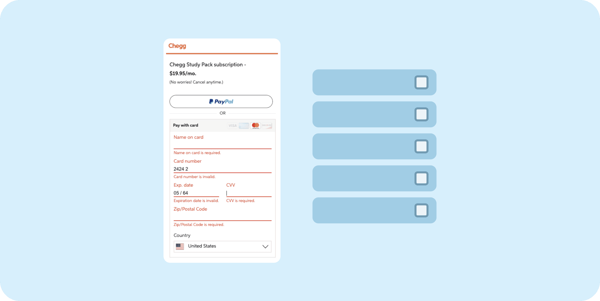
Autoformat spaces in the Credit card number field and expiration date to allow users to easily
Use an open form field, not a selection list when asking users to enter their info
Error messages should be easy to notice and understand.
For each field, present the correct keyboard, so entering zip code should show numerical keyboard
Support the continuity of the checkout experience across multiple devices. Users that start their checkout on mobile should be able to easily checkout on desktop when signed in
Impact
Recommendations were added into the product roadmap for the half. As recommendations were being implemented, we saw improvement of conversion from users that experienced error messaging during checkout.
OTHER PROJECTS
OTHER PROJECTS



Chegg
Chegg
Chegg
Improving Navigation Hierarchy
Improving Navigation Hierarchy
Improving Navigation Hierarchy


Chegg
Chegg
Chegg
Improving conversion through mixed methods
Improving conversion through mixed methods
Improving conversion through mixed methods


Chegg
Chegg
Chegg
Optimizing Marketing Landing Pages
Optimizing Marketing Landing Pages
Optimizing Marketing Landing Pages


Chegg
Chegg
Chegg
Artificial Intelligence in Education
Artificial Intelligence in Education
Artificial Intelligence in Education
© 2023 Annabelle Tsai
Resume
