Chegg
Chegg
Improving Navigation Hierarchy
Improving Navigation Hierarchy
Improving Navigation Hierarchy
This session is part of a larger study to update Chegg's navigation. This specific round was for the signed-out home page navigation experience. I am taking over this project from a Lead UX researcher, starting from the middle of this card sort. The Lead UX researcher set up the card sort, and I was tasked to take over the data collection, data analysis, report and share out, as well as any remaining rounds of the larger study.
This session is part of a larger study to update Chegg's navigation. This specific round was for the signed-out home page navigation experience. I am taking over this project from a Lead UX researcher, starting from the middle of this card sort. The Lead UX researcher set up the card sort, and I was tasked to take over the data collection, data analysis, report and share out, as well as any remaining rounds of the larger study.
This session is part of a larger study to update Chegg's navigation. This specific round was for the signed-out home page navigation experience. I am taking over this project from a Lead UX researcher, starting from the middle of this card sort. The Lead UX researcher set up the card sort, and I was tasked to take over the data collection, data analysis, report and share out, as well as any remaining rounds of the larger study.
Role
UX Researcher
UX Researcher
UX Researcher
Methods
Card Sort, Remote Usertesting, Codebook Analysis, Powerpoint presentation
Card Sort, Remote Usertesting, Codebook Analysis, Powerpoint presentation
Card Sort, Remote Usertesting, Codebook Analysis, Powerpoint presentation
Background & Objectives
Chegg offers many different features and tools for students to use. As more tools are added to our navigation, the organization needs to fit the mental models of students so that students can navigate easily. There is also an issue that students are only aware of certain tools because of the multiple tools that Chegg offers. The intended outcome for this card sort is to learn what students think about our tools’ naming conventions, and how they would organize our features. I am hoping to bring awareness to the confusion of some of our product names, and see how we can organize our products that makes sense.
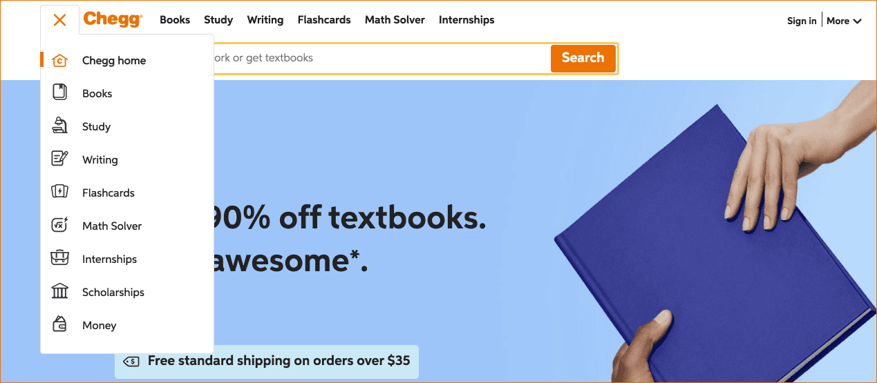
Below are screenshots of Chegg’s current navigation:


Method
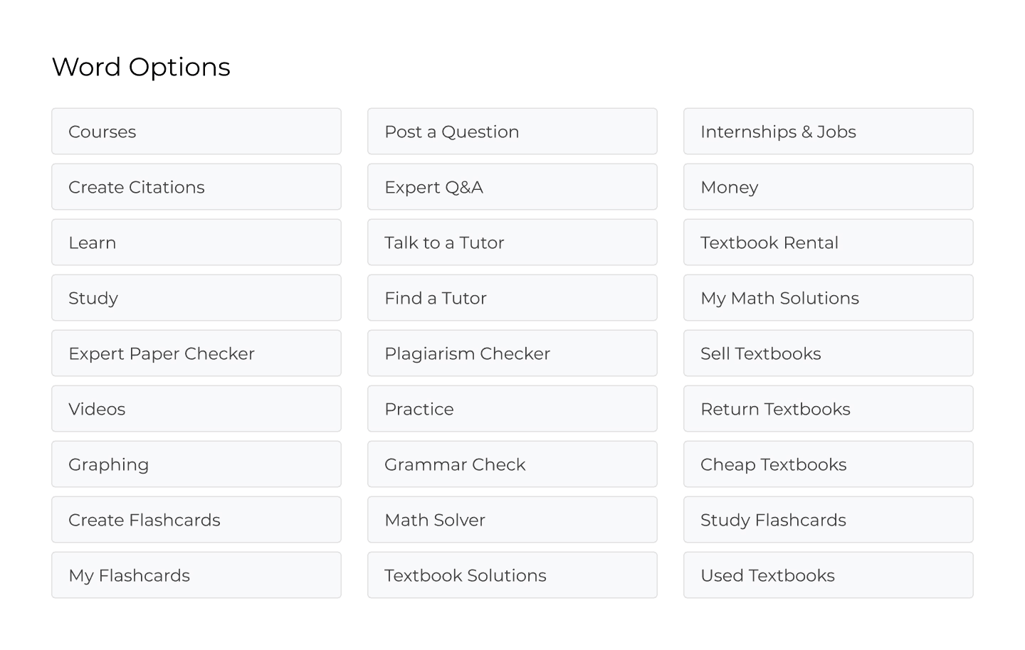
The Lead UX Researcher on this project put together a card sort when I took over this study. I recruited students over usertesting, but we used the tool OptimalSort that allows users to drag and drop, and organize various cards. We had to use usertesting because of the current state of COVID-19. Unmoderated allowed me to record their groupings and submissions, while conducting a remote card sort may have caused us to lose important data that would be analyzed later. Below includes the various tools we included in our card sort. These are all options under Chegg’s current navigation.
Participants
10 participants that identified as current students
US, UK, AUS, Canada
Analysis
For exploratory analysis, I used a codebook that allowed me to look for patterns in the students groupings and names, which allowed me to get an understanding of why students would group in a certain way.
Report and Sharing
I put together a written report, as well as a presentation with stakeholders. I included what worked well, what was unclear, and what needed to be changed so that our stakeholders could have a good idea of what we should do next.
Outcome
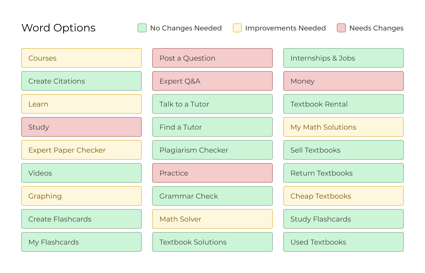
I uncovered that we have a lot of products and not enough understanding of students expectations when it comes to our navigation. Students struggled to confidently explain some of our products. Students organize based on usage type (like learning or asking for help) and prioritize groups based on the value of students. Below shows a color-coded grid of results regarding our naming conventions.
Impact
These findings were used to help drive and direct our stakeholder to see the issues with our information architecture. With this data, we can guide our next steps in research for navigation.
Reflection
In some instances, it’s okay to explain things: Typically, we’re trained not to explain things in user interviews. Instead, we’re told to probe participants about their reaction. However, after asking students to explain what they think each product is, we asked to organize the products. Unfortunately, because some product names are confusing, some sorted the features based on their incorrect assumption of the products, which skewed the data and analysis in certain aspects.
The findings after this portion of the interview wasn’t affected because students still explained their behaviors, which is what we were looking for.
Background & Objectives
Chegg offers many different features and tools for students to use. As more tools are added to our navigation, the organization needs to fit the mental models of students so that students can navigate easily. There is also an issue that students are only aware of certain tools because of the multiple tools that Chegg offers. The intended outcome for this card sort is to learn what students think about our tools’ naming conventions, and how they would organize our features. I am hoping to bring awareness to the confusion of some of our product names, and see how we can organize our products that makes sense.
Below are screenshots of Chegg’s current navigation:


Method
The Lead UX Researcher on this project put together a card sort when I took over this study. I recruited students over usertesting, but we used the tool OptimalSort that allows users to drag and drop, and organize various cards. We had to use usertesting because of the current state of COVID-19. Unmoderated allowed me to record their groupings and submissions, while conducting a remote card sort may have caused us to lose important data that would be analyzed later. Below includes the various tools we included in our card sort. These are all options under Chegg’s current navigation.

Participants
10 participants that identified as current students
US, UK, AUS, Canada
Analysis
For exploratory analysis, I used a codebook that allowed me to look for patterns in the students groupings and names, which allowed me to get an understanding of why students would group in a certain way.
Report and Sharing
I put together a written report, as well as a presentation with stakeholders. I included what worked well, what was unclear, and what needed to be changed so that our stakeholders could have a good idea of what we should do next.
Outcome
I uncovered that we have a lot of products and not enough understanding of students expectations when it comes to our navigation. Students struggled to confidently explain some of our products. Students organize based on usage type (like learning or asking for help) and prioritize groups based on the value of students. Below shows a color-coded grid of results regarding our naming conventions.

Impact
These findings were used to help drive and direct our stakeholder to see the issues with our information architecture. With this data, we can guide our next steps in research for navigation.
Reflection
In some instances, it’s okay to explain things: Typically, we’re trained not to explain things in user interviews. Instead, we’re told to probe participants about their reaction. However, after asking students to explain what they think each product is, we asked to organize the products. Unfortunately, because some product names are confusing, some sorted the features based on their incorrect assumption of the products, which skewed the data and analysis in certain aspects.
The findings after this portion of the interview wasn’t affected because students still explained their behaviors, which is what we were looking for.
Background & Objectives
Chegg offers many different features and tools for students to use. As more tools are added to our navigation, the organization needs to fit the mental models of students so that students can navigate easily. There is also an issue that students are only aware of certain tools because of the multiple tools that Chegg offers. The intended outcome for this card sort is to learn what students think about our tools’ naming conventions, and how they would organize our features. I am hoping to bring awareness to the confusion of some of our product names, and see how we can organize our products that makes sense.
Below are screenshots of Chegg’s current navigation:


Method
The Lead UX Researcher on this project put together a card sort when I took over this study. I recruited students over usertesting, but we used the tool OptimalSort that allows users to drag and drop, and organize various cards. We had to use usertesting because of the current state of COVID-19. Unmoderated allowed me to record their groupings and submissions, while conducting a remote card sort may have caused us to lose important data that would be analyzed later. Below includes the various tools we included in our card sort. These are all options under Chegg’s current navigation.

Participants
10 participants that identified as current students
US, UK, AUS, Canada
Analysis
For exploratory analysis, I used a codebook that allowed me to look for patterns in the students groupings and names, which allowed me to get an understanding of why students would group in a certain way.
Report and Sharing
I put together a written report, as well as a presentation with stakeholders. I included what worked well, what was unclear, and what needed to be changed so that our stakeholders could have a good idea of what we should do next.
Outcome
I uncovered that we have a lot of products and not enough understanding of students expectations when it comes to our navigation. Students struggled to confidently explain some of our products. Students organize based on usage type (like learning or asking for help) and prioritize groups based on the value of students. Below shows a color-coded grid of results regarding our naming conventions.

Impact
These findings were used to help drive and direct our stakeholder to see the issues with our information architecture. With this data, we can guide our next steps in research for navigation.
Reflection
In some instances, it’s okay to explain things: Typically, we’re trained not to explain things in user interviews. Instead, we’re told to probe participants about their reaction. However, after asking students to explain what they think each product is, we asked to organize the products. Unfortunately, because some product names are confusing, some sorted the features based on their incorrect assumption of the products, which skewed the data and analysis in certain aspects.
The findings after this portion of the interview wasn’t affected because students still explained their behaviors, which is what we were looking for.
OTHER PROJECTS
OTHER PROJECTS


Chegg
Chegg
Chegg
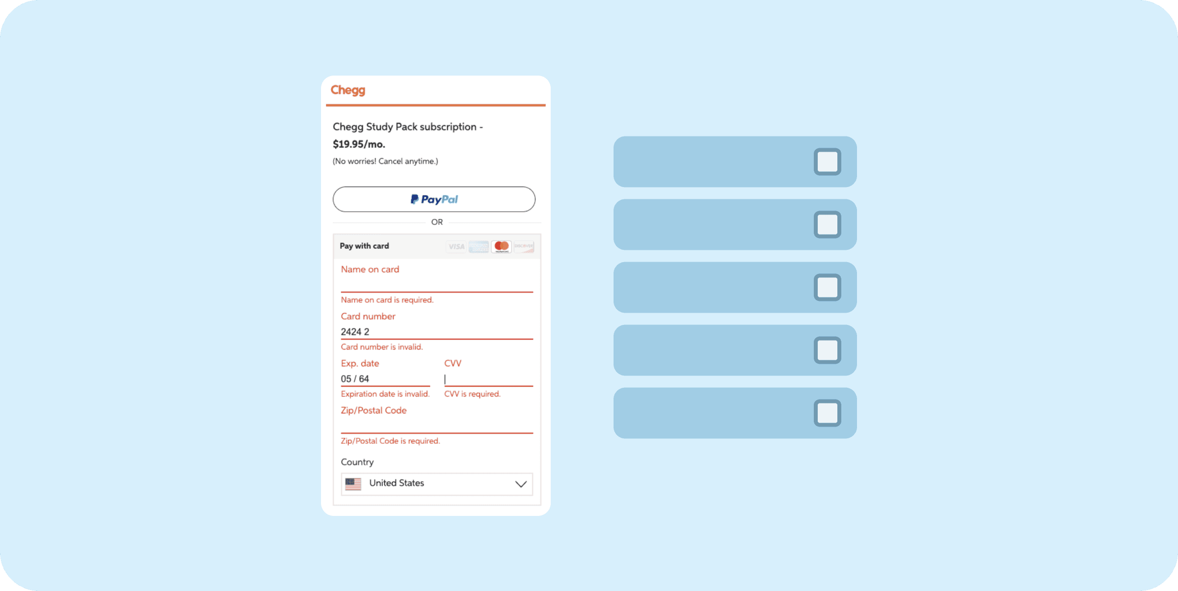
Heuristic Evaluation to Update Checkout Experience
Heuristic Evaluation to Update Checkout Experience
Heuristic Evaluation to Update Checkout Experience


Chegg
Chegg
Chegg
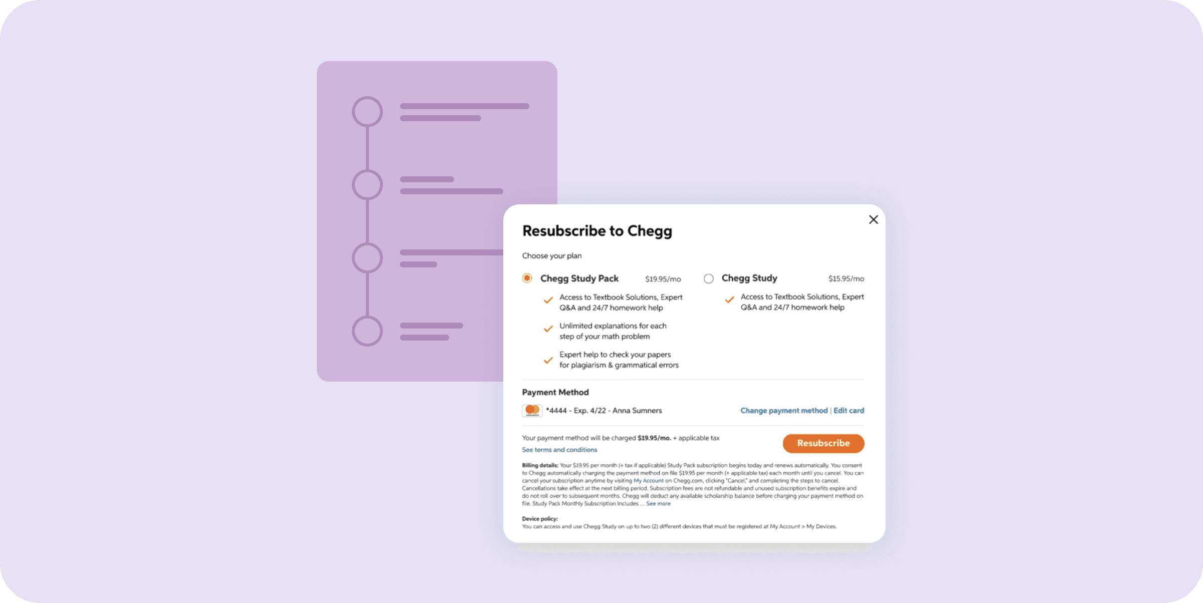
Improving conversion through mixed methods
Improving conversion through mixed methods
Improving conversion through mixed methods


Chegg
Chegg
Chegg
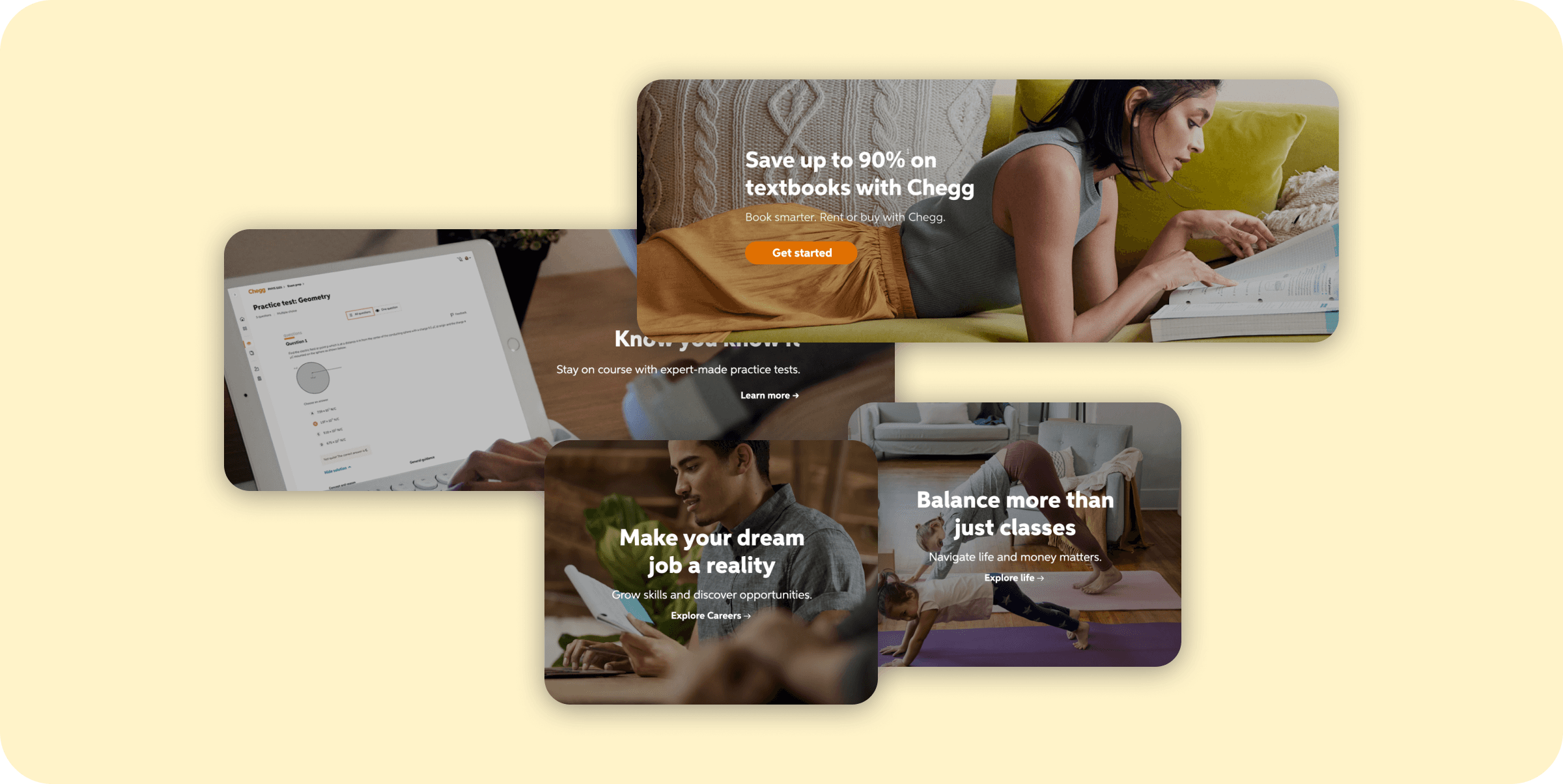
Optimizing Marketing Landing Pages
Optimizing Marketing Landing Pages
Optimizing Marketing Landing Pages


Chegg
Chegg
Chegg
Artificial Intelligence in Education
Artificial Intelligence in Education
Artificial Intelligence in Education
© 2023 Annabelle Tsai
Resume
